
Case Study
Aurea
Aurea Skincare is a conceptual packaging design project. The bright and minimal packaging is designed to stand out on shelves and appeal to a young female audience. The simplicity of the packaging is mirrored in the simplicity of the ingredients; what you see is what you get, with no frills or buzzwords to confuse the consumer.
Aurea is simple skincare for everyone.
2024
SERVICES: Packaging Design, 3D Assets, Branding, Photo Editing
SOFTWARE: Adobe Illustrator, Adobe Photoshop, Blender

Inspiration
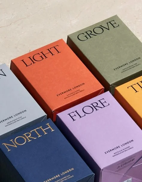
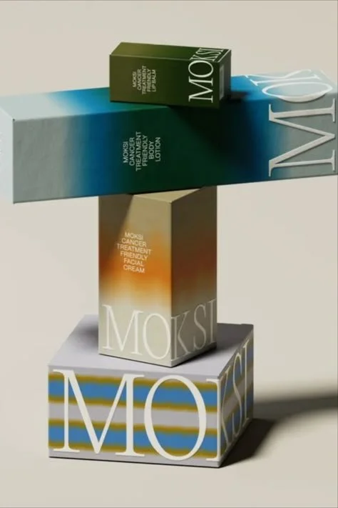
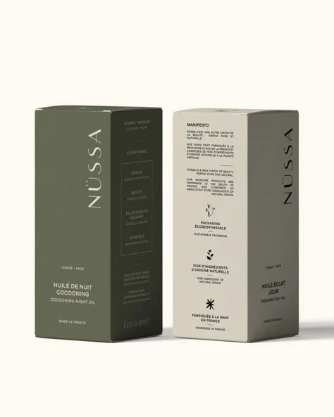
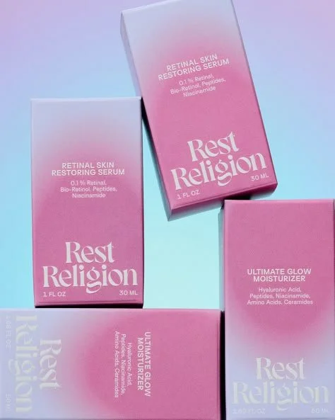
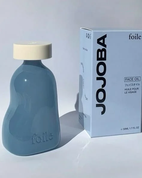
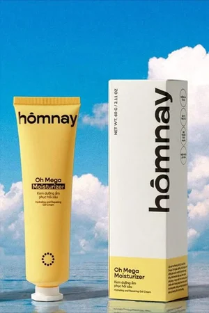
I began this project with market research and gathering design inspiration from brands with similar products and target audiences. I was primarily looking for examples of packaging with interesting typography, color gradients, and minimal design.



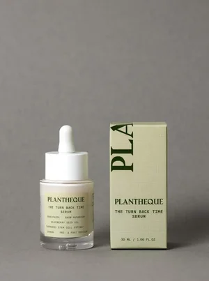

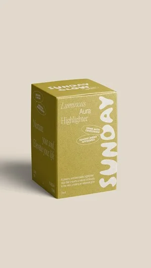


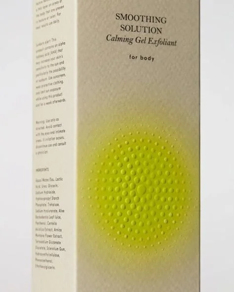

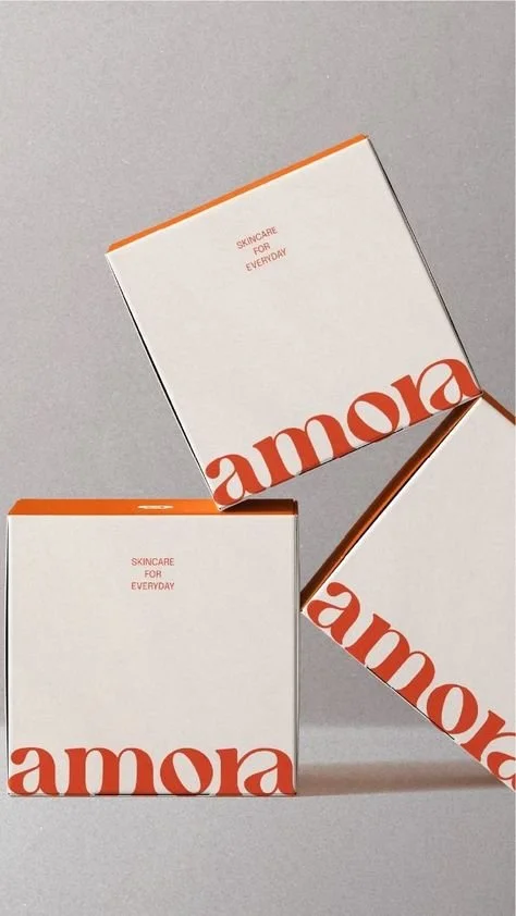

Logo Exploration
I was uniquely unrestricted with this brand due to it being a personal project, so I got to experiment with both the logo design as well as the name of the brand. I was focused on finding a name that was unique, feminine, and would convey the minimal, clean, sustainable aspects of the brand; something almost ethereal.
Shown here is a portion of my initial development file; a peek into the creative chaos, if you will.

Packaging Dielines
Using dimensions of the skincare products that I use, I created four different packaging dielines for each product size: a wide pot/jar, a tall bottle with a pump, a tall squeeze-tube, and a small dropper bottle.
Each dieline is finalized with all printer markings and dimensions.


Packaging Design
The final packaging designs feature the final Aurea logo and typographic elements, with a minimal style, clean lines, and a saturated gradient to draw the eye. The bright white makes the packaging stand out on a shelf, while the smooth, saturated gradient communicates the elevated quality of the product.
Before even picking up the product, the consumer already knows the product is clean-focused and tailored to a younger audience.

Rendered Product Images
Using the packaging designs and dimensions, I developed 3D assets for the products in order to render high-quality product photos.The products are set on a reflective sky-blue surface, mimicking the clean and ethereal feel of the brand.
The final images included 2 group images of all 4 products and their packaging, plus individual images of the products floating in mid-air, which further convey the minimal, clean, and ethereal visual identity of the Aurea brand. These images would be used in any marketing collateral or display elements.


