
Case Study
CloudExtend
In preparation to launch a new line of products, CloudExtend needed an update of their website. A light and airy theme was created, a stark contrast from their former dark visual style. MitosisCreative Agency tackled the redesign, and I was able to have a hand in many aspects of the project.
2023-2025
SERVICES: Art Direction, Photo Editing, Branding, Marketing Design, Website Design, Illustration, UI Design, Information Design
SOFTWARE: Adobe Illustrator, Adobe Photoshop, Figma, Wordpress

The Mission
In conjunction with a brand refresh, and in preparation for a major product launch, CloudExtend's website needed to be updated to reflect the lighter, airy, personable new brand direction.




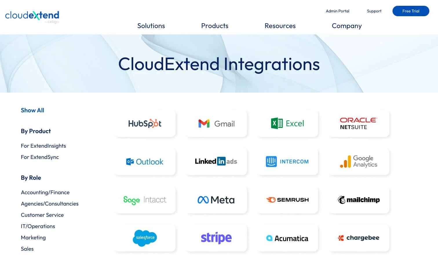
Filter UI Design
CloudExtend’s products can integrate with multiple software and platforms, which needed to be shown clearly and in a way where a potential user can intuitively filter their options by their needs, which facilitates faster and more consistent conversion.


In-Product Illustrations
Illustrations for CloudExtend’s product UI needed to be updated to reflect their new branding. I designed each alert illustration to match their updated branding, as well as updating them to feel more fun and playful; finding a good balance between organic and technical.








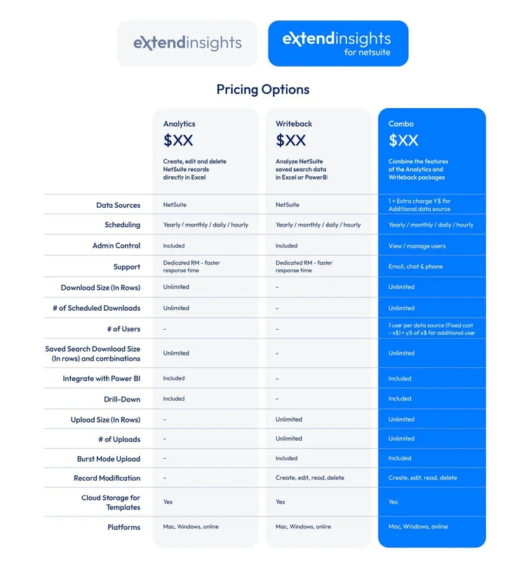
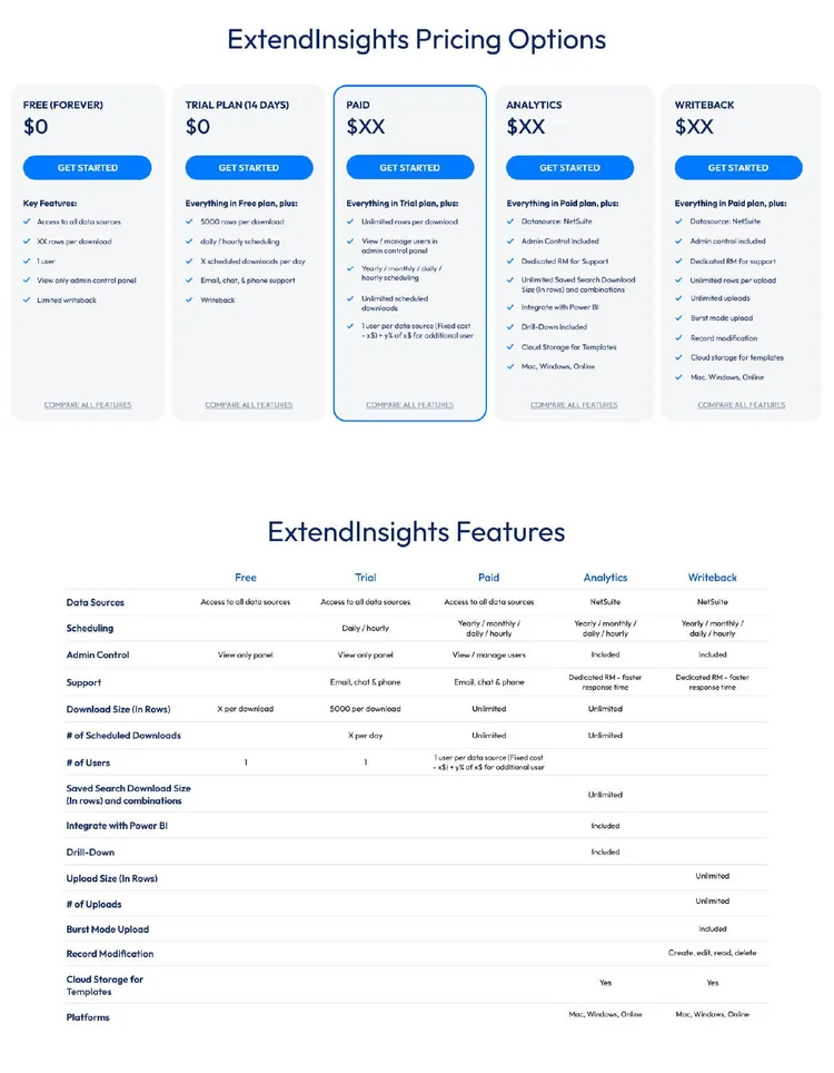
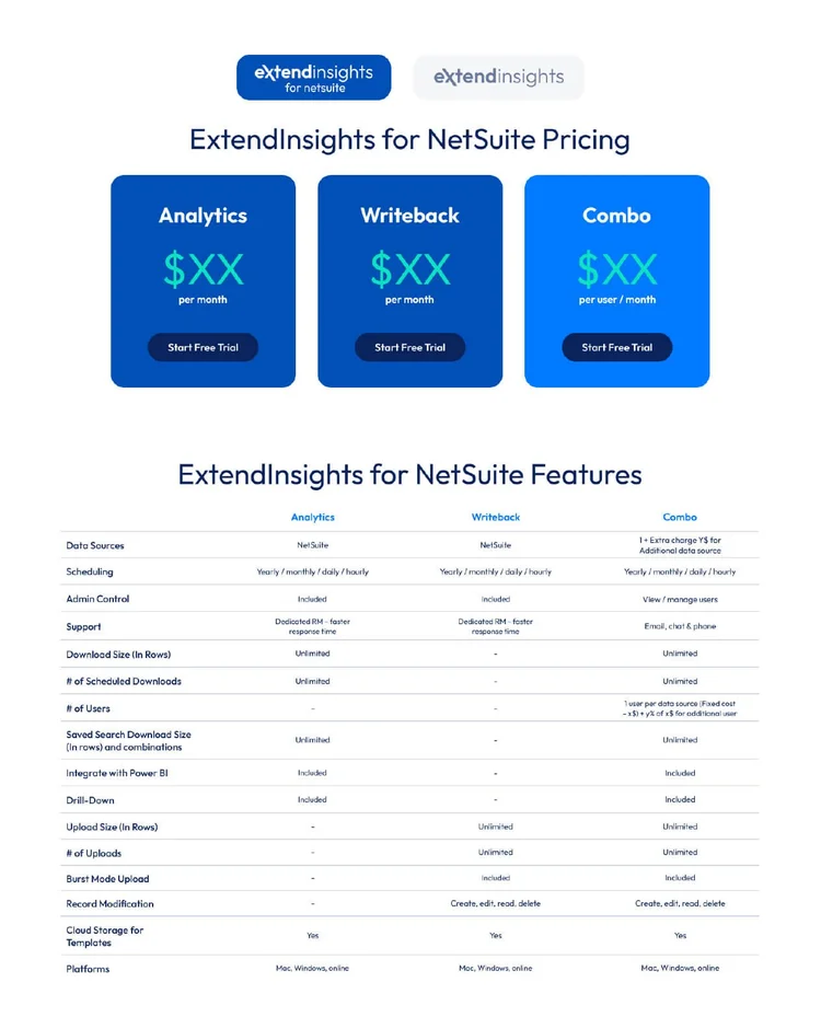
Pricing Table Design
Since CloudExtend offers different subscription tiers for each product, I took on the task of organizing this information in a way that was clear, concise, and easy to digest at a glance.
Below are a few of the concepts I designed.



In-Use Illustrations
CloudExtend wanted to showcase their product and what it looks like in-use, but in a simplified and illustrated way. I was provided screenshots of the product being used and recreated them into clean and simple illustrations.
Below are a few examples of the illustrations I created.



User Personas
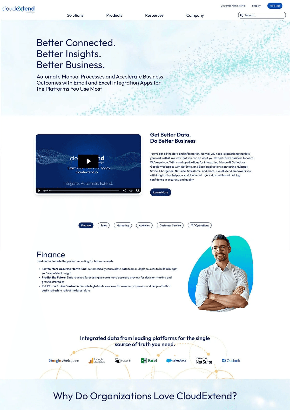
CloudExtend’s products are used by many different industries. Each industry—or user persona—has a page on their site where they are able to target that specific market. Each industry page features a persona image in the header, immediately reinforcing a personal connection with the viewer.
I specifically chose the organic shape encasing the portraits in order to give a more personable, wabi-sabi vibe, which further connects with the viewer on a personal level and creates more brand trust.
Digital Ads
A full campaign of Rollworks digital ads were designed to promote their product launch and drive users to their newly updated site. The ad set included 3 rounds of retargeting ads to drive maximum engagement.
